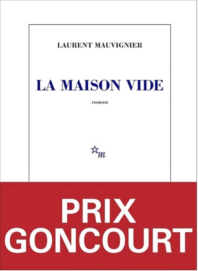
On Tuesday, November 4, after a month of deliberations, the Goncourt Prize is finally announced. Almost immediately, bookshop windows fill with the same volume: a white cover, framed by a thin blue border, bearing only a few words: La Maison vide, Laurent Mauvignier. Yet, for some years now, something new has been added. A half-jacket in vivid red now wraps the book, subtly unsettling the quiet equilibrium of its pale, traditional tones.
This gesture, that can be seen as minor, in fact signals a deeper shift taking place within the French publishing industry. It reveals how even the most established symbols of the French literary tradition (sobriety and visual neutrality), are increasingly challenged by new aesthetic and commercial logics.
To understand the symbolism behind it, we must first consider the visual tradition that has shaped the identity of French literature for over a century. In France, the appearance of a book, its sobriety, has never been a matter of design, but a cultural code in itself.
The Nouvelle Revue Française (NRF), founded in 1908, quickly distinguished itself through an almost ascetic visual identity: a white cover with a red title, a restrained use of typography, and a refusal of ornamentation. This “graphic poverty”, as critics often describe it, was not due to a lack of imagination but a deliberate aesthetic ideology. It reflected the journal’s ambition to represent neutrality, dignity and a form of literary purity. This editorial position would profoundly shape the visual language of French publishing throughout the 20th century.
This tradition was later theorized by Gérard Genette in Seuils (1987), where he developed the influential concept of the “paratext”, being everything that surrounds the text itself including titles, covers, typography and even promotional elements. For Genette, the paratext serves as a threshold between the book and the reader: it announces, guides and in many cases helps sell the text. Yet in France, the commercial potential of the paratext has long been viewed with suspicion. Influential publishers aligned with the NRF tradition, such as Gallimard or Editions de Minuit, rejected visually pleasing or spectacular covers, associating them with market logics, seen as unworthy of high literature.
The adoption of the white cover across major publishing houses soon transformed it into a cultural norm. The choice of white was anything but neutral: it conveyed a sense of purity, intellectual prestige, and voluntary austerity in a country where visual restraint often signals good taste. From this point of view, literature was not supposed to seduce the reader through colour, illustration, or typography but through language alone. The cover’s silence, its refusal to speak, was part of the book’s cultural authority.
This position, implicitly elitist but fully assumed, created a clear boundary between what was considered legitimate literature and more popular or commercial genres. While science fiction, crime novels or romance novels embraced colour, imagery and expressive design, the French classical literature insisted on graphic minimalism to showcase cultural superiority. The white cover thus functioned as a marker of ideology of anti-market distinction, a way of saying “Here, we produce literature, not entertainment”.
However, the French ideology of visual austerity must be analysed in comparison with international publishing markets. In the Anglo-American publishing sphere, the function and status of the book cover have evolved according to radically different cultural and economic principles, where visibility, marketability and graphic identity play central roles. Examining this contrasting model offers a necessary point of view for understanding the pressures currently reshaping French editorial practices.
In the English-speaking world, where cultural and economic norms are shaped by competition, consumer visibility and strong marketing infrastructures, the book cover is not a secondary paratext but a central strategic tool. The book market is vast and highly competitive, simultaneous releases in numerous formats and genres are the norm. In such an environment, a cover must capture the reader’s attention in a matter of seconds. Visual seduction is not only accepted, it is expected.
This dynamic explains why marketing departments occupy a structural place within the editorial process. They can, at times, play a more important role than editors themselves, particularly in large American or British publishing groups where sales projections, target readers and visual positioning are decided before a book goes into production. In contrast with France, where covers are often designed internally or given to discreet designers, Anglo-American graphic designers enjoy significant visibility. Their names appear in trade publications, interviews, sometimes even on the book itself and many are recognized as creative figures in their own right.
An illustrative example is David Pearson, renowned designer for Penguin Books and a key figure of contemporary British cover design. Known for his minimalist yet expressive designs, Pearson exemplifies the status of the designer as an artist whose work goes beyond the book industry. His aesthetic has led him to collaborate with Wes Anderson on cinematic visual concepts, as well as with diverse companies such as Hermès, The New York Times or Christie’s. Such trajectories are emblematic of a cultural ecosystem where the book cover is considered an independent graphic object, not just a functional wrapper.
In this context, the cover functions as part of a broader marketing package: it must be visually striking and crucially photogenic. Its design is conceived to perform not only in bookstores but also on social media feeds, online retailers and digital recommendation platforms. The Anglo-American market cultivates a logic of visibility where the book must stand out and be shared.
Although merchandising practices do exist in France, they play a less determining role, especially for the so-called serious literature still governed by the cultural codes of sobriety and tradition. The Anglo-American model, by contrast, assumes that the success of a book starts with its capacity to be seen.
The Anglo-American emphasis on visibility, branding and graphic impact has begun to exert an influence on French publishing. While the white cover tradition remains strong, a growing number of publishers have started experimenting with colour, illustration and typographic creativity. These changes reveal a slow but significant shift, as French editors navigate the tensions between inherited visual austerity and the demands of a competitive, modern marketplace in mutation.
From the early 2000s onward, the French publishing landscape has undergone a gradual yet decisive visual transformation. A new generation of independent houses, creative, daring and experimental, has begun to challenge the long-standing dominance of the minimalist cover. What started as isolated initiatives has now become a broader cultural shift, reshaping the relationship between text and image in France.
The Actes Sud editions stands among the most influential pioneers of this shift. Early-on, the house adopted a distinctly modern visual signature: an elongated book format, high-quality textured paper and a carefully curated iconography. This approach showed that a literary work could maintain its seriousness while embracing a strong aesthetic presence. Other publishers, such as Le Tripode, have taken more freedom in their approach by tailoring each book visual identity to its author, atmosphere or narrative universe. Colours, illustrations and patterns are seen as extensions of the text rather than distractions from it.
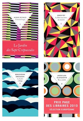
But perhaps the most emblematic one is the case of Zulma. When the house commissioned British designer David Pearson to reinvent its visual identity, the shift was both radical and immediately successful. Pearson’s distinctive geometric patterns transformed each book into a recognisable part of the new artistic direction of the house. Within a few years, Zulma’s sales reportedly tripled, showcasing how a bold design strategy can revive a publisher’s image and widen its audience.
Beyond editorial creativity, technological changes have further accelerated this evolution. The rise of online book retail has introduced a new constraint: the cover must remain visible and readable even when reduced to a tiny digital thumbnail. With such conditions, overly bland designs tend to disappear visually, overshadowed by bolder competitors. Strong typography, high-colour contrast and distinctive patterns have thus become of new must-have elements of cover design. What was once a purely aesthetic choice has turned into a technical necessity.

These pressures have progressively pushed traditional French publishers to adapt. Coloured bands and half-jackets, once exceptional, are now the norm even among the most conservative literary houses. Prize-winning books are increasingly accompanied by visual emphasis and new collections aim to refresh classic titles with contemporary graphic interpretations. The creation of Gallimard Graphic, which reissues work in collaboration with prominent designers whose names are featured on the cover, exemplifies the institutional pivot.
This change is also driven by the expectations of a younger, globally exposed audience. To many new readers, the traditional white cover appears as cold, elitist and uninviting. The decline of the white aesthetic therefore also marks the decline of a symbolic frontier between expert readers and the general public. In this sense, the move toward more colourful, accessible designs may help democratise access to literature, reducing the intimidation once associated with the French classical literature.
Far from signalling the disappearance of a French cultural exception, the recent evolution of French book cover design reflects a process of renegotiation rather than rupture. White covers are still the norm for French traditional publishing houses. This restrained design, once a proclamation of literary purity and cultural distinction, is not being abandoned but recontextualised in a publishing environment that must navigate through global competition, digital visibility and the expectations of a younger readership. What results is not the triumph of one aesthetic over another but a more fluid market where tradition and innovation coexist.
This negotiation highlights a deeper problematic: how to redefine what cultural legitimacy looks like in the 21st century. By allowing colour, illustration and graphic experimentation into the realm of serious literature, the French publishing world is trying to answer this question. In this sense, by shifting from white minimalism to more expressive designs, French publishers do not reject tradition but rethink how it can continue to resonate in a world where the act of reading (and of choosing what to read) has itself profoundly changed.
Author: Justin Wiesler-Lambs